


It’s April 2025: birth month of dashboards, as the first live data is connected. It’s also the culmination of our nine-month gestation, finally revealing, on a dashboard, what Richard Smith’s total estimated retirement income might be.
Mission: Impossible - The Final Reckoning opens next month. Seen the trailer? If not, have a watch.
Here’s the pensions dashboards version:
“Our retirement incomes are not defined by any one pension. Our incomes are the sum of our saving choices. Every employee you were, every job you’ve done, has come to this.”
This is it. Episode 9 of 9. Finally seeing what the total estimated retirement income (ERI) might be.
Thanks so much for sticking around – I know how it can be dull hearing about someone else’s life. But I promise you, when it’s your pensions you’re viewing on a dashboard, you’ll be super excited too.
It’s a visceral experience; not just about money, but about the whole of your life so far, and to come.
So come on then: let’s see how well I’ve spent my life so far, and what the future might hold.
Avoid perfection
First, let’s be clear: initial dashboards won’t be perfect, and that’s perfectly okay. Optimal even. It’s an impossible mission to launch perfection, so, given that none of us are Tom Cruise, we’d be daft to try.
In fact, the government’s own Design Principle #5 Guidance for developing online services says: “The best way to build good services is to start small and iterate wildly. Release minimum viable products early, test them with actual users, move to live, and make refinements based on feedback.”
This sentiment was echoed by all the teams I met on my independent research tour of continental dashboards in 2023. Michael Rasch, who runs the Danish dashboard, recommended in Copenhagen: “Start small, launch an early version, learn, iterate – do not try to launch everything all at once.”
Workarounds work (for now)
Launching a minimum viable product means certain user needs won’t be met initially.
What will be my specific unmet needs on day one of the launch of dashboards? There are at least three:
- Pension Protection Fund (PPF) compensation missing: As we explored in Episode #7, my £3,670-a-year PPF compensation won’t be shown as it requires a law change. As a workaround, using a private sector dashboard, I could add this manually.
- Spouse’s pension out of scope: Episode #6 explained how my spouse’s pension, which is already in payment (currently £533 a month net, received in my bank account), is out of scope for the first iteration of dashboards. One workaround here is to use an open banking-enabled private sector dashboard and connect my current account so that my spouse’s pension amounts received can be shown in my overall total.
- Wrong defined contribution (DC) retirement ages: As described in Episode #1, Episode #3 and Episode #4, to stay in growth assets as long as possible, I’ve set the retirement age on three of my four DC pensions to age 74. So, the ERIs returned for these will be too big, given I expect to start taking money from them long before I’m 74. As a workaround, I’ll probably just look at my current total DC fund value and multiply by 4% as a rough estimate of a sustainable drawdown annual income I could take from 65.
What else won’t initial dashboards do?
The above are just three examples of unmet needs on day one, which are very specific to me. But there will be loads of other unmet needs initially, varying across different types of users. For example:
- Shallow data: When I led the consultation on the proposed data standards for dashboards – amazingly five years ago now, in 2020 – many industry respondents argued for additional data elements like DC charges, investments, and contributions. None of these are shown on initial dashboards as the initial objectives are to connect people with their pensions and show basic income and fund values.
- Income first: Some in the industry still don’t like leading with ERI. For DC pensions, they feel fund value is more important, despite consistent consumer research insights showing that income is most wanted.
- No cash: Commentators bemoan that there will be no tax-free cash amounts shown on initial dashboards. That’s because taking tax-free cash is a scheme-specific option, and no such options are on the first iterations of dashboards.
Data matching problems
More fundamentally, will data matching work at scale? Will all my pensions actually be found?
In Depth: 40% of master trust memberships could consolidate
Two in five master trust memberships could be eligible for consolidation due to individual members having multiple pots across different providers, according to major study led by the Pensions Policy Institute and featuring five of the biggest master trusts. Read more
When I drafted the original version of the Data Matching Convention Guidance for the Pensions Administration Standards Association (PASA) in 2021, the focus was largely (but not exclusively) on national insurance numbers, last names and dates of birth.
However, I worry some integrated service providers (ISPs) are too focused on just those three data elements for matching. The award-winning, large-scale, 2022 research report I authored for ISP Pension Fusion (Getting to the heart of matching) showed that using those three elements alone will fail to find 10% of pensions.
Matching is hard: it’s why PASA called in 2021 for a ‘Find-only’ service to be launched first.
Managing expectations is key
We can reasonably expect there will be quite a lot of complaints from real consumers when they first start using dashboards. “My X isn’t shown.” “It doesn’t work because of Y.” “I can’t do action Z.”
A big, big lesson from continental Europe is that these complaints will largely come from a noisy minority of more engaged users, and their expectations must be actively managed in advance.
Anders Lundström, former chief executive of minPension, the Swedish dashboard, said in February: “Users might expect a fully polished product, but the reality is the first version is just the beginning. It’s crucial to manage the narrative, working with the media, to explain that this is an evolving journey.”
Focus on the key positive: total estimated retirement income
We all need to focus on the amazing fact that these first dashboards show, to a citizenry who today are largely “detached, afraid and complacent”, the total estimated retirement income (ERI) they might get.
As I explained to the Work and Pensions Committee last month, statistics from the continental teams on the usage of dashboards’ different webpages show the vast majority of users only visit the homepage, specifically to see their total ERI. It’s the thing most people want to see, as you can see from this video.
Based on these and other insights, UK dashboards are similarly being designed to lead with total ERI, summing up the different ERIs returned by all your different pension schemes and providers.
For me, that means my four DC pensions (Episodes #1, #2, #3 and #4), my three defined benefit pensions (Episodes #5 and #6) and my state pension (Episode #8). My PPF compensation (Episode #7), as we’ve seen, will be missing.
So here, at last, is what my total ERI screen might look like. Note that this is the “Now” tab rather than the “Future” tab, because of the age 74 complication I mentioned above.
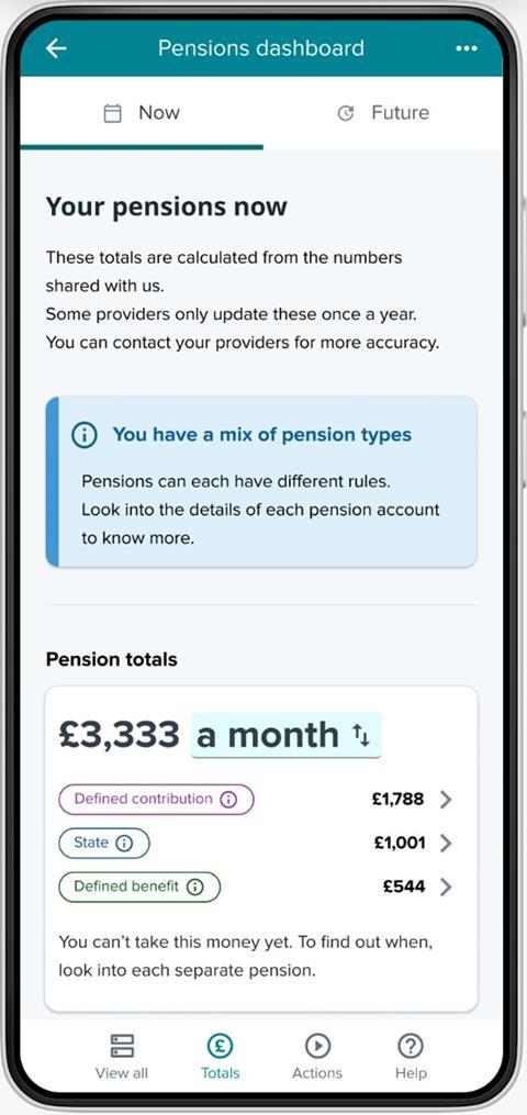
What total ERI will be shown for you? Could you live on £3,333 a month from age 67? Is it enough?
It’s so powerful, emotional even, seeing your Total ERI, and asking your future self: “Is it enough?” I’ll be talking about this emotional response at Quietroom’s Wednesday Wisdom on Wednesday 2 April.
My £3,333 a month shown is, of course, gross before tax. £3,333 a month is £40,000 a year, which, after deducting 20% income tax, assuming a personal allowance of £12,570, is £34,500 a year net. And that’s assuming I don’t take any tax-free cash from any of my pensions (I might, I’m not sure yet).
This £34,500 annual total is only £1,700 a year more than the £32,800 a year “moderate” Retirement Living Standard outlined by the Pensions and Lifetime Savings Association, for a singleton like me living in London and the south-east of England.
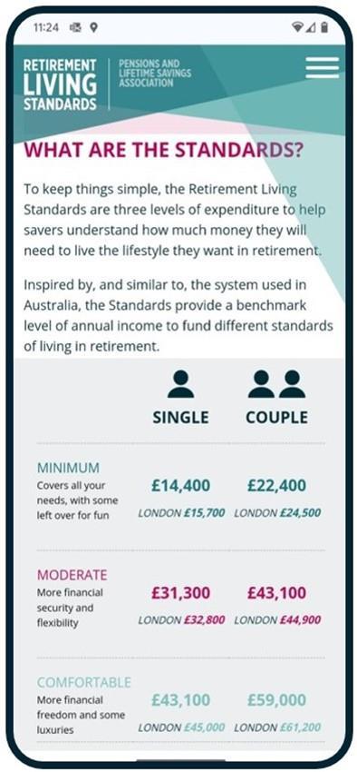
Based on these figures, I’ll be moderately OK in retirement, but quite a long way from “comfortable”.
Seeing their total ERIs like this, on the main page of a dashboard, will likely be a big shock for millions of people.
Despite this being a shock, we really need to let these people know. As I told the MPs on the Select Committee, it’s a great thing that “total ERI on dashboards finally ends the invisibility of inadequacy”.
What can I (you) do next?
What would you do next after seeing your monthly total ERI figure on a dashboard like this?
The various ‘next step’ actions users might take will vary depending on their individual circumstances. Very briefly, a (non-exhaustive) list of things I could do, based on my specific circumstances, is:
- Add in my missing pensions: My missing PPF compensation, and my spouse’s pension already in payment, amount to about £10,000 a year gross, increasing my £40,000 a year above to about £50,000 a year. That’s £42,500 a year net after tax, so heading towards the £45,000 a year level required for a “comfortable” Retirement Living Standard.
- See the DC pension incomes I want: Hold your horses, though. The DC incomes shown are level, as explained in Episode #4, whereas what I want to see are smaller starting DC incomes that keep pace with inflation. I could click through to my DC providers’ websites to get the income figures I want.
- See a more appropriate target income: The PLSA’s Retirement Living Standards are OK, but it’s a blunt tool and not personalised – the figures include allowances for holidays and a car, but I’ve given up flying and driving. Much better is to connect my current account via open banking and get a categorised analysis of what I actually spend.
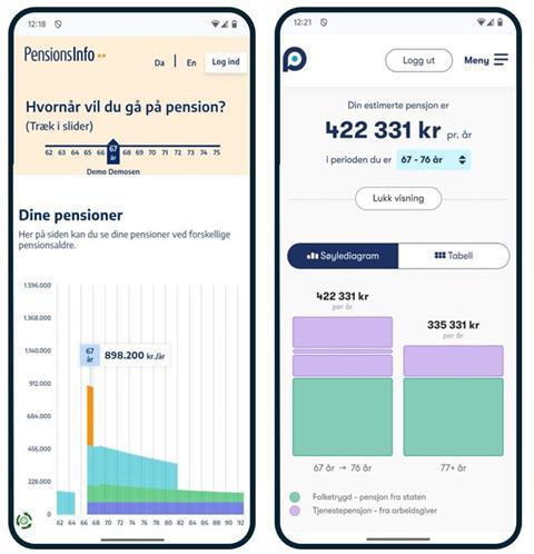
- Work out if I can retire before state pension age: The £3,333 a month is what I might get to by the time I reach state pension age, but suppose I want to start taking some of my pensions earlier than this? To visualise if I can afford to do this, and see how my income might vary over my retirement years, I’ll likely need a graphical timeline display, like the below examples from the Danish and Norwegian dashboards.
Most consumers’ biggest emotional reaction
For millions of consumers, this potential shock over discovering their total estimated retirement income will be inadequate could cause various emotional reactions or desires to take action.
The big hope with private sector dashboards was that they would enable a low friction way to click-through, for example to employers’ payroll systems, for consumers to increase their contributions.
But, as I told MPs, and explained to the Pensions Goth, we’re unlikely to see any private sector dashboards, and certainly not any time soon, given how onerous and uncertain the pathway is for firms to do their own dashboard. Firms just can’t make the case given the multi-faceted uncertainty.
It remains to be seen how different people react to seeing inadequate incomes on the MoneyHelper Pensions Dashboard. How well will this dashboard help them cope with their additional fear, and how easily will it enable users to improve their position, for example by increasing their contributions?
MoneyHelper dashboard citizen testing
We’ll start to understand these reactions pretty soon. This month, more than 50 million pension records worth over half a trillion pounds are due to be connected to the dashboards ecosystem. It’s amazing really.
Then, a couple of months after that, in the summer, private beta testing of the MoneyHelper dashboard is due to begin, with invited citizens viewing their real pensions. This is an incredibly exciting major milestone.
This is where the real work starts, though. Continental evidence shows that live citizen testing will highlight lots of ways in which the service needs to be improved and iterated.
Some of these changes can be deferred until post-launch, to version two of dashboards or subsequent updates. But other changes will be urgent and will need to be made before the MoneyHelper dashboard can be launched.
The required changes could be to the MoneyHelper display, to the data being supplied by providers, to the Pension Dashboards Programme standards themselves, and even to the Department for Work and Pensions’ Dashboards Regulations and the Financial Conduct Authority’s rules.
A huge industry-government collaborative effort is going to be required to co-ordinate all this testing and the resulting changes required, moving us towards the public launch of the MoneyHelper dashboard.
Thanks, good luck, and keep going!
I wanted to say a huge thank you to all the representatives and media staff at my different pension schemes and providers for all their help with this series of articles.
Thank you also to Amy Lobé, user experience lead at Moneyhub, for all her excellent dashboard designs which have made my words intelligible; to Nick Reeve at Pensions Expert for publishing the articles – and to you, dear readers, for your time and interest.
The very best of luck if you’re involved with connecting pensions data from this month onwards. And even more good luck if you’re helping with the MoneyHelper citizen testing from the summer onwards.
It may seem like we’ve been driving uphill on dashboards for ages, but we just need to make one final push to get the MoneyHelper dashboard tested and launched.
Channelling the Mission: Impossible trailer once again: “When the odds are deemed impossible, the mission falls to us – should we choose to accept.”
We’re on the cusp of something amazing in UK pensions, benefiting millions of consumers, for decades to come.
As Anders Lundström, a true global expert on pensions dashboards, has said: “Doing dashboards is a long, complicated and painful process. But when you look back, over many years, you can see they’ve helped many, many people.”
Richard Smith is an independent dashboards consultant.
Dashboards Nine-Nine: How Nest is preparing for connection day

With nine months to go to the first dashboards connection deadline, independent pensions dashboards consultant Richard Smith presents the first in a series of profiles exploring how firms are preparing.
- 1
- 2
- 3
- 4
- 5
- 6
- 7
- 8
 Currently
reading
Currently
reading
Dashboards Nine-Nine: The finale – viewing your total estimated retirement income